11 categories, including cardiovascular, digestive, endocrine, oncology, and respiratory conditions.
Research study · Data visualization · 2025
Do we really know how to use graphs effectively?
A study of how familiar charts can clarify, distort, or conceal categorical relationships for non-expert readers.
01 / Research problem
A graph can be technically correct and still lead a reader toward the wrong conclusion.
Data visualization shapes decisions, but non-experts are often given charts chosen by habit rather than by the question being asked. Categorical data makes this especially visible: the same values can appear as a line, grouped bars, stacked totals, or normalized proportions, and each form changes what the eye notices first.
- Advisor
- Dr. Beomjin Kim
- Institution
- Purdue University
- Scope
- Categorical vs. categorical data
02 / What the poster studies
One dataset. Three chart decisions.
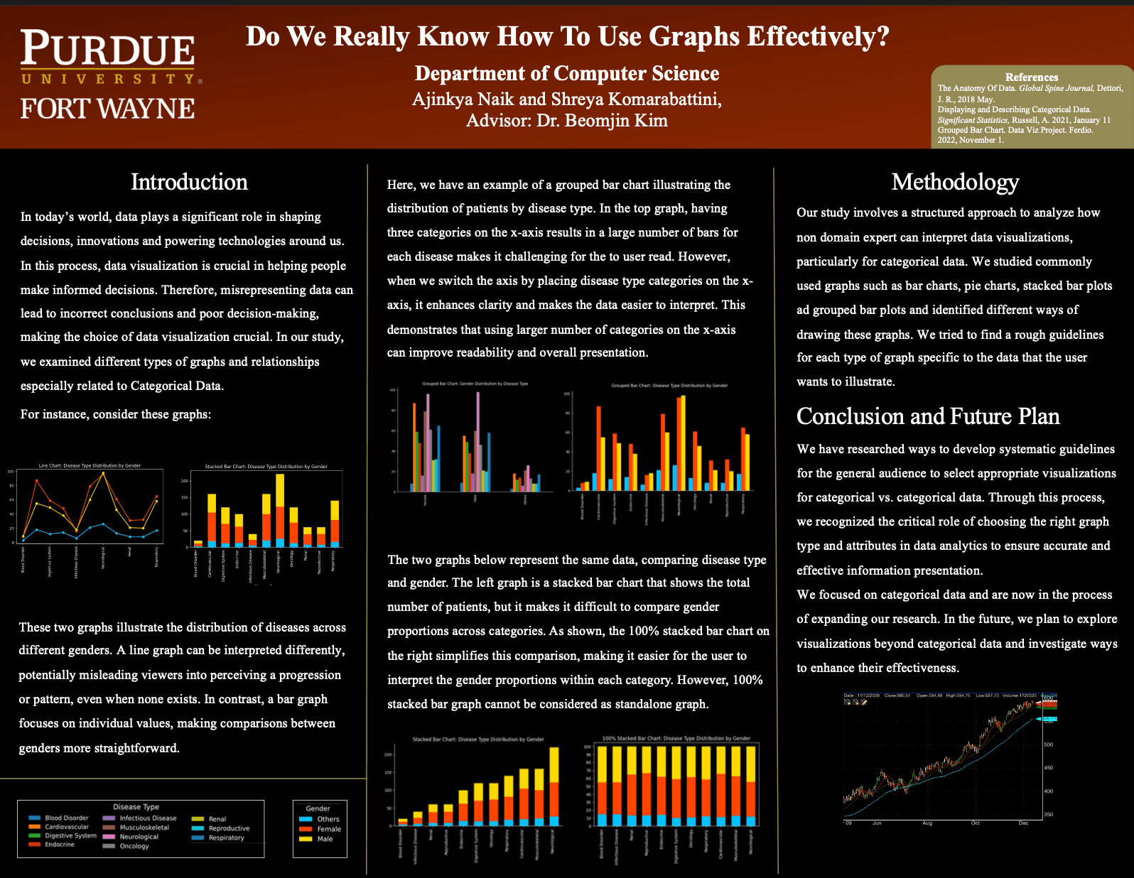
The poster compares patient counts across disease types and gender categories. Both variables are categorical. It tests how chart form, axis orientation, and scale change what a non-expert notices.
Three groups (female, male, and other) compared within every disease type.
The number of patients represented by each disease-and-gender combination.
01Chart formLine or bar?
→02OrientationWhich categories belong on each axis?
→03ComparisonTotals or proportions?
The central question
How do chart type and visual attributes influence what a non-expert can accurately compare?
03 / Method
Hold the data steady. Change the representation.
The team held the disease-and-gender data steady, then redrew it as line, grouped bar, stacked bar, and 100% stacked bar charts. Each comparison asked what became easier to see, what disappeared, and what a non-domain expert might misread.
- 01Define the relationship
Compare patient counts across disease types and the three gender categories.
- 02Build competing views
Represent the same question with different chart forms, orientations, and normalization choices.
- 03Compare the reading task
Evaluate clarity for individual values, totals, proportions, trends, extremes, and dense category sets.
- 04Turn observations into rules
Document when each form is effective, insufficient, or likely to mislead a general audience.
04 / Decision one · Chart form
First explain the task: compare discrete disease categories.
Disease types do not form a continuous sequence. A line connects them anyway, which can make the peaks and dips look like a progression. Grouped bars remove that invented journey and give each patient count a common baseline.
BeforeLine chart
A connected line suggests movement or progression.
05 / Decision two · Orientation
Then arrange the chart around the larger set of categories.
The poster tests two grouped-bar arrangements. Grouping many disease bars beneath only three gender labels creates dense clusters. Giving each disease type its own position creates smaller, repeatable three-bar groups and makes the labels easier to scan.
06 / Decision three · Comparison
One chart showed the totals.
The other showed the proportions.
Stacked bar
How much is there?
Preserves total magnitude, but makes internal segments difficult to compare because most do not share a baseline.
+
100% stacked
What share is each part?
Clarifies category proportions, but removes the size of each total and cannot tell the complete story alone.
Finding: When both magnitude and composition matter, present the views together. One is context for the other.
07 / Poster findings
Chart form creates meaning
A line connecting categorical values can imply order, continuity, or progression, even when none exists.
Totals and proportions answer different questions
A stacked chart preserves magnitude; a 100% stacked chart makes composition easier to compare. Important work may require both.
Category count changes the answer
A grouped bar works well with a few categories, but becomes visually overwhelming as the number of bars grows.
Layout is analytical, not cosmetic
Axis direction, category order, color range, labels, and scale can decide whether a pattern is readable or misleading.
08 / Research artifact
Presented as a Purdue Fort Wayne research poster.
09 / Reflection & limitations
A useful framework, with more testing still ahead.
The project produced systematic guidelines through comparative visual analysis. It did not establish one chart as universally superior, and the poster does not report a controlled participant sample or quantified comprehension results.
Future work can validate the guidelines with formal user studies, test accessibility and color perception, expand beyond categorical data, and measure how domain knowledge changes interpretation.
The takeaway
Choose the graph for the question, not because the software made it easy.
Good visualization is not decoration after analysis. The chart type, scale, axis, order, and companion views are part of the analytical argument itself.